Of all the things I get to do as a website and graphic designer, one of my favorite tasks is working on logo design and branding. I love working with companies to figure out how to represent their business in a small scalable image.
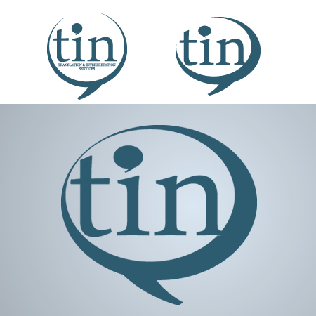
I recently completed a logo design for a translations business called TIN. The graphic below shows the three major stages of the logo. It started as a round speech bubble with the text on the inside. After chewing on that for a while and thinking through how it would work on a website, on letterhead, and on business cards, I decided to make it more sleek, remove the text from the inside (partly because of legibility in small applications – as you see here), and point the inside speech bubble in the opposite direction (like a back and forth conversation). In the third round of design, I closed off the crescent shape and reversed the direction each of the bubbles was pointing (to help with eye flow when used in the top left of a website).
I think it turned out very nice.
